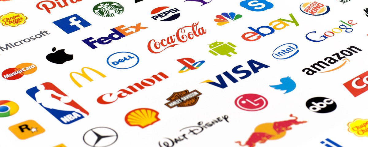
Visitors decide whether they trust your blog in just 0.05 seconds. That is faster than a single blink of your eye. In that tiny slice of time, your logo does all the heavy lifting for your brand. It acts as a digital handshake, telling readers if you are a professional or just someone messing around with a keyboard.
When I started my first indie game, I thought a logo was just a "pretty picture." I had a budget of zero dollars and ended up creating what I now call my early pixelated nightmares. It was a blurry, neon green mess that looked like a digital accident. I learned the hard way that 60% of people prefer brands they can recognize immediately.
If your logo looks like a mistake, people often assume your writing is a mistake too. Blogs that use a clear, professional visual identity-which is just a fancy way of saying a consistent "look"-see three times more engagement than those that do not.
The good news is that you do not need a design degree or a huge pile of cash to look great. You can build a distinct identity yourself by making a few thoughtful choices. We are going to look at three ways to get this done without losing your mind.
First, we explore online logo makers. Think of these like a boxed cake mix where the hard work is done, and you just add the frosting.
Second, we dive into free design software. This is more like building with LEGOs from scratch; it takes more time to learn, but you can build anything you imagine. Finally, we look at the power of word art.
Sometimes, a clean font is all you need to look like a high-end brand.
Creating your own mark is about avoiding simple blunders and picking the right tools. You can move past the blurry nightmare phase and build something you are proud to show the world. Let's get your blog looking the way it deserves.
Why Your Blog Needs a Visual Vibe
Jumping straight into design software without a plan usually results in a digital mess that confuses your readers. I learned this the hard way. My first blog featured a neon green pixel art cat on a professional finance theme. It was a disaster.
90% of a visitor's first impression of your blog is based purely on visual design. This isn't not a cosmetic tweak. It creates a night and day difference in how people feel before they read a single word of your content.
The Essentials of Identity
In the early stages of your journey, you must have your blog name finalized and your niche-the specific topic you write about-locked in. A logo for a "Budget Travel" blog needs a completely different energy than one for a minimalist poetry site. I spent six hours on a logo once, only to realize it looked like a law firm's letterhead.
Colors tell a story before your text does. This involves color theory, which is simply the science of how colors affect our moods. Red might signal excitement.
Blue feels trustworthy. You also need to consider typography-the style and appearance of your printed words.
Serif fonts look traditional, while sans-serif fonts look modern and clean.
While it feels intimidating, the foundation is actually dead simple. Pick two primary colors and one readable font, then move on. This groundwork will help you evaluate logo design options later based on your specific brand identity.
- Identify your target audience's age and interests.
- Choose a brand personality like "playful," "serious," or "elegant."
- Select 2-3 primary colors using a tool like Coolors.co.
- Pick 1-2 fonts that are easy to read on mobile screens.
My early pixelated nightmares happened because I ignored these basics. I focused on what I liked instead of what my audience needed.
On your digital drawing board, a simple square canvas of 1000x1000 pixels is the best place to start your brainstorming. It keeps your elements balanced and easy to scale for social media or headers.
Crafting Your Icon with AI Assistance
15 minutes is the average time it takes for an AI logo generator to churn out dozens of visual concepts for your new blog. Back when I was building my first indie game, I spent forty hours hand-drawing a character that still looked like a lumpy potato. Using modern tools like BrandCrowd or Looka feels like cheating in comparison, but in the best way possible for a busy blogger.
Through these platforms, you can bypass the "blank page" panic by letting an algorithm do the initial brainstorming. You just feed it your blog name and a few industry keywords-like "food blog" or "personal development"-and it presents a gallery of options based on the visual vibe you've already identified for your brand.
- Pick Your Platform - Start with a user-friendly site like Canva or Hatchful. Most offer free trials or basic free options that are perfect for a zero-budget hustle.
- Input Your Details - Type in your blog name and niche. The AI uses this to suggest icons that actually make sense for your content.
- Sift Through Templates - Browse the generated icons and layouts. Look for a base that feels right, even if the colors aren't perfect yet.
- Apply Customization - Spend 30 minutes to 2 hours tweaking the details. Stick to 1-2 fonts and 2-3 primary colors to keep things professional and clean.
- Grab Your Files - Download the final result in PNG or JPEG format. If the site offers an SVG (a file that stays sharp at any size), grab that too.
Customizing is where the real magic happens. It is dead simple to get carried away and click every button in sight, but remember that less is usually more. I once made a logo with five different colors and three fonts; it looked like a circus poster had a fight with a rainbow. It was one of my early pixelated nightmares that I hope you never have to repeat.
Avoid using the first template the AI suggests without significant changes. Thousands of other bloggers likely use those exact default icons, which can make your brand look like a generic copycat.
But a logo that looks great on a giant desktop screen might turn into an unreadable smudge on a smartphone. Small adjustments to spacing (the room between letters) and layout (how the icon sits next to the text) ensure your name stays clear even on a tiny screen. Always check your design at a small size before you hit that download button.
3 hours is the maximum time you should spend on this entire process from start to finish. If you find yourself obsessing over the exact shade of "seafoam green" for four hours, you've hit a wall. A distinct identity comes from making a choice and sticking to it, not from chasing perfection in a template gallery.
Professionalism comes from restraint, not adding more "stuff" to the canvas. While these AI tools give you a fast start, they sometimes struggle with unique, complex shapes that only a human hand can truly master. Sometimes, the "click and drag" simplicity of an AI tool hits a ceiling when you want a shape that doesn't exist in a library yet.
Beyond Templates: Unleashing Creativity with Free Software
Designing Scalable Visuals in Inkscape
Online logo makers offer speed, but they often lock your creativity inside a pre-built box. To break free, you need a tool that handles vector graphics. Unlike standard photos, these images use mathematical paths to stay perfectly sharp whether they are on a tiny business card or a massive billboard.
In my early pixelated nightmares, I tried to make logos using basic photo editors. I learned the hard way that a raster graphic, which is made of tiny dots, becomes a blurry mess when you stretch it. Inkscape solves this by letting you draw shapes that never lose their edge. It is a powerful, free alternative to expensive professional software, though it does require some patience to master.
1000x1000 pixels is the standard starting size for a digital canvas in most design projects. While you can scale your work later, starting with a square workspace helps you keep the design balanced. You aren't just picking a template here; you are building an identity from scratch using lines, circles, and custom paths.
- Install the Software - Download Inkscape from its official site and run the installer. It works on Windows, Mac, and Linux, making it accessible for any budget.
- Set Your Canvas - Open a new document and use the properties menu to set a square workspace. This keeps your icons centered and ready for social media profile spots.
- Draft Basic Shapes - Use the circle and rectangle tools to create the skeleton of your icon. You can combine these shapes or trim them to create unique symbols.
- Import Free Assets - Grab SVG files from the Noun Project or Flaticon to add professional elements. These files are ready-made vectors that you can recolor and resize without any quality loss.
- Apply Brand Colors - Use specific hex codes to ensure your colors match your blog perfectly. These six-digit codes act as a digital fingerprint for the exact shade you want.
Learning the basic tools usually takes 2 to 4 hours of focused practice. I recommend skipping GIMP entirely for logo work because it handles pixels rather than paths. Designing a simple logo might take you 2 to 6 hours, while something complex can easily eat up a whole weekend. The trade-off is total control over every curve and corner.
Every file needs a proper home once the design is finished. You should export your work as a PNG with a transparent background for your website header. Save a copy as an SVG too. This "master file" allows you to make changes later without starting over, which is a lifesaver when you decide to tweak your brand colors next year.
While vector shapes provide a strong professional structure, they don't solve every design puzzle. Many bloggers find that the most difficult part isn't the icon, but the way the letters sit next to it. The next challenge involves the letters themselves, where spacing and font choice create a different kind of magic.
Mastering Typography for a Unique Mark
Two to six hours is the average time you should spend crafting a professional text-only logo from start to finish. This might seem like a long time for "just some words," but these hours represent the difference between a brand that looks like a hobby and one that looks like a business. Between 30 minutes and 2 hours of that time belongs to font research alone.
I spent way too many nights during my game dev days staring at "early pixelated nightmares" because I didn't understand that fonts have personalities. Choosing the right one is the foundation of your blog's identity. It tells your reader if you are serious, fun, traditional, or cutting-edge before they even read your first post.
Style matters.
Inside the Google Fonts library, you will find thousands of free options ranging from serif (fonts with little "feet" on the letters) to sans-serif (clean, modern fonts without feet). Script fonts look like handwriting, while display fonts are bold and loud. Stick to one or two fonts to keep things from looking messy.
But picking a font is just the first step.
You need to master kerning, which is the specific space between two individual letters. Sometimes an 'A' and a 'V' look like they are fighting if they are too far apart. You also have tracking, which adjusts the space across the whole word, and leading, which handles the vertical space between lines of text.
Avoid using more than two different fonts in a single logo. Mixing too many styles creates a cluttered look that makes your blog feel disorganized and amateur.
One to three hours of your design time will go toward experimenting with these tiny adjustments in tools like Canva or Inkscape. It is a no contest choice for beginners-Canva is easier for quick results, but Inkscape gives you total control over every line. I recommend starting simple and focusing on how the letters sit together.
By changing the font weight (the thickness of the lines), you can make one word pop while the other sits quietly in the background. This isn't a cosmetic tweak. It directs the eye to the most important part of your blog name.
Color adds the final touch.
For your palette, pick a primary color for your main name and a softer secondary color for your tagline. This creates a visual hierarchy that helps people remember your name. You can follow this simple workflow to get started:
- Browse Google Fonts for 30 to 120 minutes to find a style that fits your niche.
- Select one primary font and one secondary font that complements it.
- Open your design tool and type your blog name.
- Adjust the tracking and kerning until the letters feel balanced.
- Export your final design as a PNG with a transparent background.
A subtle element, like a small underline or a stylized letter, makes a simple word feel like a custom mark. These small choices build a professional identity without needing a single hand-drawn icon. It is about precision, not decoration.
Yet, even the most beautiful font fails if nobody can actually read it. This is where many bloggers trip up, accidentally choosing styles that look great on a big screen but turn into a blurry mess on a phone. The line between "elegant" and "unreadable" is thinner than you think.
Beginner Blunders: What NOT to Do with Your DIY Logo
Avoiding Generic Looks and Pixelation Headaches
A professional logo acts as your blog’s digital handshake, but a sloppy one tells readers to turn around and leave. It hurts your credibility instantly. I remember my first gaming blog logo looked like a blurry mess of neon green and purple. It was one of those early pixelated nightmares that made my site look like a scam from 1998.
But even the best tools can't save you if you lean too hard on a generic template. Spending 15 minutes clicking "next" on a logo maker usually results in a design that looks exactly like 500 other travel blogs. You need to customize colors and icons significantly to avoid that "off-the-shelf" vibe that screams "amateur."
In your quest for a unique look, keep your palette and fonts strictly limited. Using more than two fonts or three primary colors creates visual noise that confuses the eye. Stick to a visual hierarchy-the arrangement of elements to show importance-so your blog name stands out first. You want a distinct identity, not a rainbow-colored puzzle.
Clutter kills brand recognition. Stick to the basics.
Design your logo using vector tools like Inkscape to ensure your brand stays sharp and professional at any size.
60% of DIY designers forget to check for raster versus vector files before they start. Raster images, like those made in GIMP, are built from tiny dots called pixels. If you try to stretch them, they get "the jaggies"-that blocky, blurry look that ruined my first site. Use vector software instead, because these tools use math to keep your lines perfectly sharp whether they are on a tiny phone screen or a giant billboard.
Saving your work without a transparent background is another common disaster. Without this, your logo will sit inside an ugly white box on your website. This happens when you save as a JPEG instead of a PNG. It’s a dead giveaway that you didn't quite finish the job.
Under no circumstances should you use images from a random Google search. Copyright issues represent a ticking time bomb for new bloggers. Only use icons from royalty-free sources to stay safe. To keep your design clean and legal, follow this quick checklist:
- Use only 1-2 fonts to keep the text readable.
- Select 2-3 primary colors that match your blog’s mood.
- Ensure all icons are royalty-free or custom-made.
- Verify that the logo is legible when shrunk down to the size of a postage stamp.
- Avoid overlapping text that creates "negative space" tangles.
Readability matters more than flair. Avoid those over-styled, curly fonts that look like a plate of spaghetti. If a reader has to squint to see your name, they won't remember you (a mistake I made more times than I care to admit).
500x500 pixels is the bare minimum size for exporting a raster logo, but even that won't help if your file type is wrong. The way you save your final masterpiece determines if it looks like a pro job or a digital smudge. Choosing the right export settings is the final hurdle between a "DIY project" and a legitimate brand asset.
Polishing Your Mark: Final Touches & File Formats
Exporting Perfect Files for Web & Beyond
Blurry logos are the fastest way to lose a reader's trust. It is a hard lesson. I remember my early pixelated nightmares where I uploaded a tiny file and watched it turn into a blocky mess on a laptop screen.
Across every blogging platform, the file format you choose dictates how your brand appears on different screens. You have three main choices: PNG, JPEG, and SVG. Each one behaves differently when you upload it to your site.
But choosing between them requires understanding what happens behind the scenes. A PNG (Portable Network Graphics) file allows for a transparent background, which is dead simple for placing your logo over a colorful website header. JPEGs are smaller files, but they always have a solid background color.
500x500 pixels is the minimum size you should aim for when exporting raster images. These are graphics made of tiny dots that can look fuzzy if you stretch them. If you use a free logo maker, check the resolution limits before you hit download.
Scalability changes everything.
An SVG (Scalable Vector Graphics) file uses math to draw your logo, so it stays sharp whether it is on a tiny phone or a massive desktop. This is no contest the best format for logos, though not every free tool offers it.
After testing dozens of platforms, including software like Inkscape, I recommend skipping the JPEG for your primary logo file. It often adds "noise" or blurry spots around your text. A messy look for a professional blog.
- Verify Your Colors - Use hex codes (six-digit color codes like #3355FF) to ensure your logo matches your website buttons exactly.
- Run a Uniqueness Check - Upload your final design to a Google Images search to make sure you didn't accidentally copy a famous brand.
- Export Multiple Sizes - Create a 500px version for your header and a 100px version to use as a favicon, which is the tiny icon in a browser tab.
Standardizing your files now prevents your logo from looking stretched or squished on social media later. A single 100px file ensures your blog looks professional even in a tiny browser tab.
Deploying Your Brand Across All Platforms
Deciding where to place your brand-new logo is the first real test of your blogging journey. It shouldn't feel like a chore. You have the file ready, so now you just need to make sure the rest of the internet sees it exactly how you intended.
Where to Put Your New Design
In my early days as a game dev, I once uploaded a logo that looked like a blurry thumbprint on mobile screens because I ignored the size. My early pixelated nightmares were a result of poor planning. You want your design to stay sharp whether it is on a massive desktop monitor or a tiny smartphone screen.
But a logo that looks great on a 27-inch monitor might become a messy blob on a smartphone. This is why legibility is your best friend. A dead simple way to test this is to zoom out to 10% on your screen to see if you can still recognize your brand name or icon.
Keeping Things Uniform
Six-digit hex codes-those strings like #FF5733-ensure your "sunset orange" doesn't turn into "brick red" on a different computer. This isn't just a cosmetic choice; it is a way to stop your brand from looking messy. Computers use these codes to identify colors exactly, so keep that number written down somewhere safe.
A favicon represents your brand in the browser tab right next to your blog title. This little 100-pixel square is a huge deal for brand recognition. New bloggers often forget it, but having one makes your site look finished and professional.
Consistency is the only way to build trust with your new readers. I eventually created a brand style guide to track my choices, which saved me hours of guesswork later. This document serves as a rulebook for your blog's look, listing your specific fonts and colors so you never have to hunt for them again.
- Upload a 500px wide PNG with a transparent background to your blog header.
- Set your 100px square icon as the site favicon in your settings.
- Update your profile picture on Pinterest, Instagram, and X (formerly Twitter).
- Add a small version of the logo to your email signature.
Skip the expensive email signature plugins that charge a monthly fee. A simple image link works just as well for a new blogger. No contest. Your logo should be the first thing they see and the last thing they forget.
Conclusion
Your logo is the digital handshake of your blog. It doesn't need to be a masterpiece carved in stone, but it does need to be intentional. My first brand was a neon green mess that looked like a digital sneeze because I tried to do everything at once. You can avoid my early pixelated nightmares by focusing on clarity over clutter.
- Customizing a template for 30 to 120 minutes ensures your brand doesn't look like a carbon copy of every other blog in your niche.
- Vector files, like an SVG, act like digital rubber bands; they stretch to any size without getting blurry or pixelated.
- Limiting your palette to 2 or 3 primary colors using Hex codes-special ID numbers for colors-prevents your design from looking like a chaotic box of melted crayons.
- Text-based logos rely on kerning, which is the invisible space between letters, to make sure your blog name is easy to read on a tiny phone screen.
Open Inkscape or Canva today and set up a square canvas of 1000 by 1000 pixels. Pick one font that feels like your blog’s personality and type your name in black and white to check the balance before you add any color. Your logo will likely evolve as your site grows, so do not feel pressured to reach perfection on day one.
A professional look comes from the decisions you make, not the money you spend.

