When you need something to stick with your audience, infographics can help. Studies show that after three days, people only remember about 10% of what they hear, but that number jumps to 65% when using visual communication.
Infographics boil down to data storytelling, or taking complicated, complex information and depicting it in a way that's easy to understand. In order to have success with infographics, they need to be engaging and easy to understand. These ten tips will help you develop an effective infographic.
1. Pick a Topic for Your Audience
There's no point in creating an infographic just for the sake of having infographics. You're not going to get much engagement if your audience isn't interested in what you're sharing. Pick a topic that speaks to their needs, interests and/or pain points. Remember, an infographic can only go viral if it gets shared again and again. They only way that sharing will start is if it first resonates with your audience.
Take a look at what your audience is talking about on social media, forums or send out a survey if you need ideas.
2. Create a Catchy Title
The title is the first thing people will see about the infographic. Unfortunately, this necessary component is often put on the back burner. What story does your infographic tell? How will help your audience? Try and communicate that in your title. Infographics are all about visual communication, so your title's job is to draw them in to look.
A catchy headline is short, uses catchy adjectives and utilizes negative wording like "stop" and "without." But above all, your headline should be an accurate description of what they're about to see. Never compromise truth for trendy.
3. Use the Right Tools
Not many people will want to read or share your infographics if they aren't visually appealing. It can also be very time-consuming to build an infographic from scratch, Excel charts are boring to look at, and not everyone can afford to hire a graphic designer. Fortunately, there are tools like Visme that make data visualization easy and eye-catching, and you don't even need to have design experience.
4. Outline the Components
The first two components discussed, the topic and title, lay the foundation for your infographic. Now you'll need to outline a couple more components to flesh out your data storytelling: the data you'll actually be using and the overall theme.
Make sure you check and verify sources for your data; it doesn't matter how engaging your infographic is if the information is incorrect. Look at reputable websites and blogs in your industry and save any important data points you find. When you're confident with data, you can move on the developing the theme. Figure out how the data will flow from one point to the next.
5. Develop a Focal Point
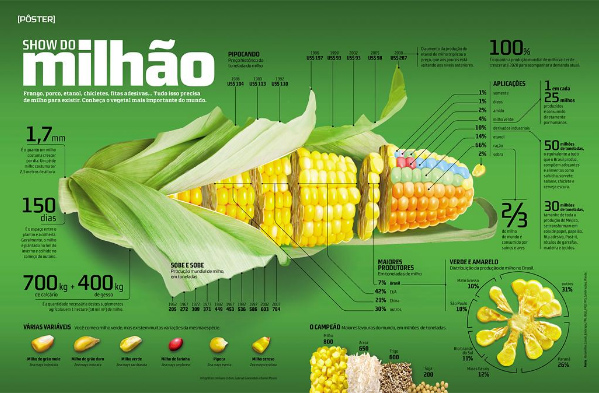
Visual communication should be simple. If you have too many things going on at once, it can be hard to understand what's going on, which is why many describe it as "too busy." You can simplify your infographic's design by developing a central image to focus on. There can be smaller images that assist telling the story, but a strong focal point will draw people in and allow their eyes to digest what's happening more naturally.
The focal point should be at the center of the infographic or one of the far ends. The following infographic isn't in English, but you can see how it has a strong focal point with smaller images and point flanking it:
6. Use Metaphors
The best way to approach visual storytelling for data that is usually boring: metaphors. For example, say you need to depict how countries are doing selling a particular product. Why not make it a horse race? Each country can be represented by a horse - it makes it more fun and easy to see the comparisons.
7. Limit the Text
Infographics are a form of data visualization, which means there should be minimal reading involved. Because humans prefer to digest visual content, infographics are 30 times more likely to be read than text articles. If you're planning an infographic with a lot of text, it might as well be a blog post or e-book.
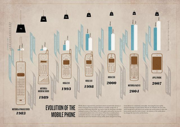
A quick test: have someone look at your infographic without reading any of the parts, and ask if they are able to grasp the general concept. They won't be able to tell you details, but they should be able to tell you the core message you're trying to convey. This infographic on the evolution of phones is a good example:
8. Cite Sources
The bottom of your infographic should include fine print with your sources. People want to know where you're getting the data from, and references on the bottom are reassuring.
This is especially true if you're just starting out with content marketing and looking to make a name for yourself. Don't let all that data-digging homework you did go to waste; show the URLs where you got your data.
9. Size it Right
Vertical infographics perform better than horizontal ones when it comes to sharing. It's much more natural to scroll up and down than it is to go left and right.
You don't want to go overboard with length, though. Keep it below 1800 pixels. Visuals may help with short attention spans, but it's still possible to go overboard.
10. Make it Shareable
In order to get the most shares, it needs to be easy to share your infographic. You can do this by creating embed codes and social sharing buttons. You should also offer two versions of your infographics: a high-resolution full version, and a smaller snapshot image that will display more easily in social media feeds. For downloading, keep the file size less than 1.5 MB.
Ready To Make Your Own Infographic?
Now that you know what makes a good infographic, it's time to get started. Start brainstorming your infographic and use online tools that give you a good starting point, such as Visme, to visualize your story.

