Landing page is where the sum total of your online marketing efforts is concentrated and evaluated. Done well, it’s a magical being that drives leads/sales to you even while you and your team sleep. Done wrongly and it you could keep waiting for an eternity for a visitor to stay and just… click that CTA.
What could go wrong?
Oh anything, really. What I have learned from my experience is that product landing pages require the best of marketers, copy writers, web designers and developers, and UX and UI designers, a lot of trial-and-error before it gets even close to good.
All their efforts combined boil down to the steps that ensure that the landing pages:
Capture Attention
With Design
A clean and highly polished design will immediately attract attention. Let’s break it down:
- You want your design to be Highly Polished because your page must look and feel ‘premium’ if you want the customers to pay for the product/service it’s talking about.
- You want it to be Clean because you need to draw attention to the right elements and not blinking, flashing chaos.
With Copy
Of all your content, the headline and sub-headline will draw the visitors’ attention first. In those few words, you have to make sure that you:
- Describe what visitors get from the product/ service
- KISS: Keep It Simple, Silly
- Don’t make it too long
- Don’t use jargon
Essentially: Be simple, clear, and concise. Visualize your visitors as people instead of targets or numbers.
Here’a quick test: Get a pen and paper; take a look at this top fold for Pocket landing page, and name the first 3 things you felt:
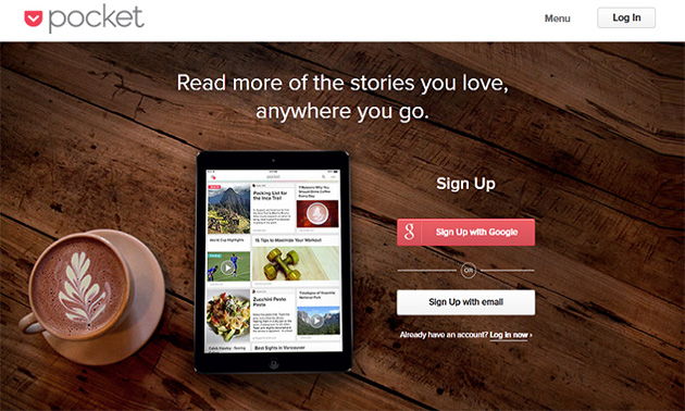
Note: Your landing page isn’t meant to convert everyone; it’s meant to speak to people who are ideally placed as your targeted audience. For instance, someone who finds reading a bore/chore won’t be very interested in something like Pocket in the first place, but avid readers who find this page will be tempted to get the product
Create Interest and Desire
Once you have your visitors’ Attention, you need to create some Interest for your product and Desire to get it. This is why UX design is integral to landing page success. Do it:
With Design
It’s a matter of keeping design clutter free and clean so the visitor stays focused on what you’ve got to say. If you must use pictures, make sure they’re relevant, used in context, and not cliché stock photos.
With Copy
You also need to write a copy worthy of that distraction-free reading.
- Features List that tells visitors what your product/service is, how it’s different/better/more awesome than everyone else’s.
- Benefits List that tells visitors what they gain.
Bonus: Business is give-and-take, so you can try offering some freebies/discounts to encourage that click.
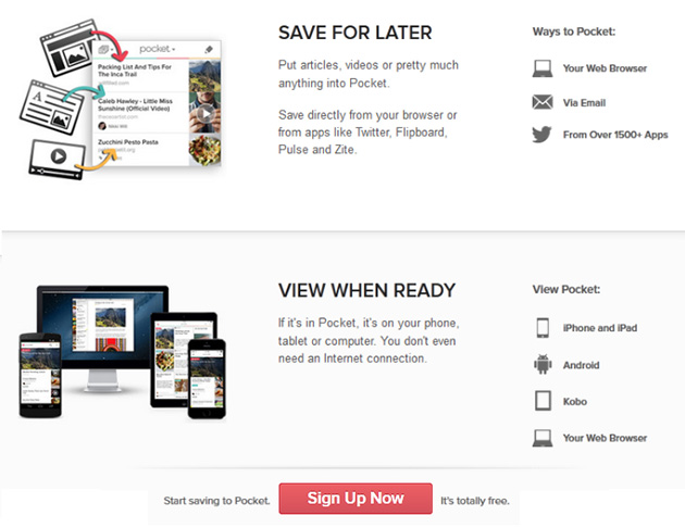
Here’s the rest of that page from Pocket:
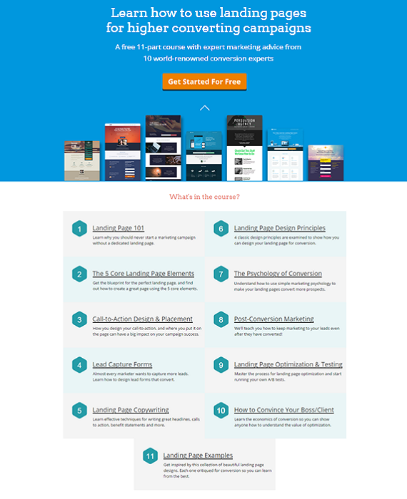
How about The Landing Page Course, by Unbounce, which states what you get (and gives away introductory knowledge and tips about those lessons as freebies too!)
Call to Action
There are two very simple rules you would do well to remember while creating and placing that pivotal button for and on your landing page. These are:
- Have a single, clearly stated objective: On the button, state clearly what the user gets when he/she clicks on it. Instead of using boring, cliché, generic verbs like “Download" or “Submit", use specific and relevant phrases. If your brand identity goes with it, you can even try out-of-box terms like “Hit it!" or “Let’s do it!" Bonus points if you can make it compelling.
- Make it Stand out from the rest of the page: If I am taking a cursory glance at your page, your CTA button should pop out from the rest like a huge neon sign. Use high contrast, bright colors, and strategic placement (learn about the F-pattern most skimmers’ eyes follow) to your advantage.
That’s it, really. These are all the ingredients you will need for baking a perfect landing page.
Now to sort out the good from the unnecessary:
The Removal of Roadblocks
Anxiety
living under a rock for the past 5 years, you have probably watched The Wolf of Wall Street. Within the first 20 minutes, Jordan Belfort (DiCaprio) is seen teaching his homeboys the need to build trust in a hilarious induction training scene.
“The only real objection they have is they don’t trust you guys. And why should they trust you? I mean look at you, you’re a bunch of sleazy salesman right?!"
DISCLAIMER: This is in no way supposed to promote bad practices or fraud of any form and should be taken in the spirit of example. If you consider yourself a sleazy salesman, why are you here in the first place?
Bottom Line: Reduce Anxiety. Use trust elements like social counters (shows that there are real people who like your service/product), testimonials (success stories that builds trust in your audience as an authentic provider), and the best of all: trust logos and seals (there are valid studies proving their positive impact on conversion and revenue).
Annoyance
Not a single person on the entirety of World Wide Web will ever contest the significance of short forms. Neither should you.
You are probably asking your visitor to download something, or sign up to your humor website, or anything really. Kindly cut-down the ‘bureaucracy’ as much as you can and adjust your form length accordingly.
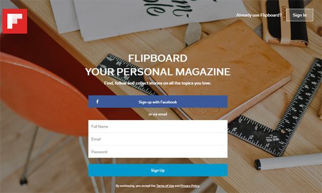
Keep annoyance at bay with small forms like Firefox Pocket (as demonstrated above), Twitter, and Flipboard.
Skepticism
Even though your audience knows that they are interacting with real people through the website, they don’t actually see you and will probably forget this fact. They are directly interacting with a web interface and their experience is limited to viewing, clicking, etc.
Now to use this as a way to connect with your audience...
A good practice for ‘real-world’ services (with online portals and landing pages) and providers of SaaS (Software as a Service) is Humanization.
Check out this above-the-fold space for some obscure app no one knows about:
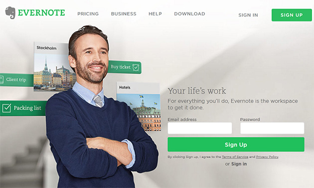
Evernote always, always makes it a point to have a person up there. And not just some cheesy stock photo model looking straight at the camera and smiling like a beauty pageant contestant, but someone who actually looks like a real person. They even subtly emphasize this person with creative 3D effects.
Key point: Humanization works great and it’s worth trying out for your own landing page.
Distraction / Information Overload
There are two things you can remember:
- Target specifically: Create one landing page per product/service. Your audience isn’t stupid, but let’s put direct their focus on one thing at a time. This also improves your conversion with simple math: More landing pages == More visitors == More chances to convert.
- Remove distractions, all of them: No menus or links that take visitors elsewhere. Proper placement (read F-pattern again) of text and pictures in relation to each other for most impact. Consider eye-tracking.
Testing and improving
This extensive process starts with landing pages, involves marketers, UX architects, developers, designers, and others, and goes on forever. Amazon never stops testing and improving its interface.
That is terrifying, but if you aren’t achieving (realistic) goals your landing page was designed for, there’s something wrong and it needs to be fixed.
Essentially
No one can create a great landing page in one shot. Things will always need tweaking to achieve perfection. And that’s half the fun in designing landing pages (the rest comes from finally getting it right).
Keep researching, testing, and improving. That’s the only advice you’ll eventually follow at the end of the day.