Most of us are very good at replicating a mockup exactly but fail to write code that is DRY and well organized. If you have some experience in front-end development, you would agree that CSS is a language that is very easy to learn, but it is extremely difficult to maintain, especially on large websites.
If you want a solution for that, you might find the Object-oriented CSS (OOCSS) approach to writing CSS useful. A web design company in Chennai used this technique, and they experienced amazing progress in their productivity website maintenance. You can also try this if you want to write CSS in a better way that will make your life a lot easier. This article would cover what OOCSS is, why do we need to use it, and how we can use it. Before, diving into the details of OOCS, we can explore what all the issues we will run into if we don’t write CSS code in an organized way.
New CSS Code Doesn’t Work the Way as We Expect
When we try to scale up the website, the CSS we write may not work as expected due to a style block at the top in the CSS document with a higher CSS specificity. Then we have to use location dependent styling or !important technique to get the style we want. It may solve the problem temporarily, but it will get severe when we try to modify the website again in the future.
Messy and Cluttered CSS Code
Another problem with the code is that when we reopen a project that we did a few months back or a project done by our colleague, we may often wonder “what the hell these lines of CSS code do?" looking at the thousands of lines of CSS.
Repeating Same CSS Style Blocks Again and Again (CSS is not DRY)
Often we repeat the same set of CSS style declaration multiple times on different elements. The repeating lines make CSS document so long which will increase the document size and loading time.
OOCSS is a panacea for all these issues. Once you see how easy it makes maintaining a website, you will use this technique in all your projects; small or large.
What is OOCSS?
Unlike SASS or LESS, OOCSS is not a technology built upon CSS. It is a just an organized way of writing CSS code to make it easily manageable. The technique was initially proposed by Nicole Sullivan, who was working for Yahoo at that time, and later many people have come up with similar tactics including BEM and SMACSS.
The fundamental idea of OOCSS is the abstraction of repeating patterns into reusable objects.
The repeating set of CSS styles on the website are abstracted or taken out and make modules or objects out of them using CSS classes which can be reused on different elements on the website. It helps us to avoid repeating the same set of CSS rules again and again because the CSS style modules or objects can be reused on multiple elements as we want.
Examples for Repeating Pattern
You may have buttons of different sizes and colors on your website, but all of them may have common styles like:
- border radius
- padding
- style of the text inside the button
- box-shadow
You can take these common styles and apply them to a CSS class. This class CSS class can then be reused on all buttons on the website. So, we don’t have to repeat these CSS styles on different buttons with varying colors and sizes.
Another good example of the repeating styles is different types of containers on a page. You may have the main column, a sidebar, and small widgets, etc. on a web page. Most of the time, these containers have a common pattern in their style.
Example from Nicole Sullivan
You might have seen multiple elements on a web page share the same set of styles. Here is an example of repeating patterns from Facebooks website as demonstrated by Nicole.
Media Object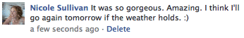

Variations of Media Object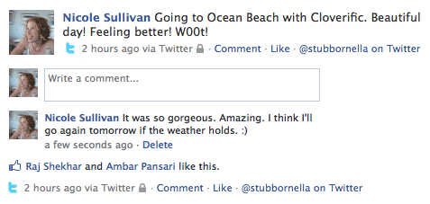
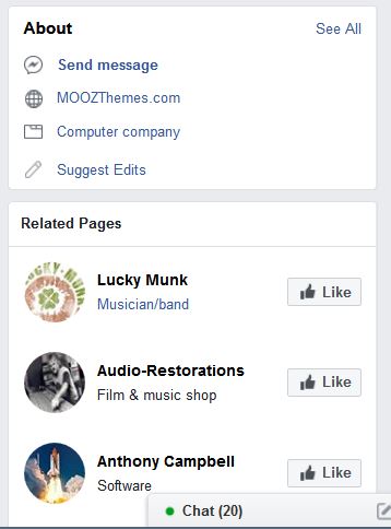
Repetition of Media Object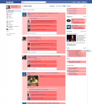
(All images are taken from the article written by Nicole on her blog: http://www.stubbornella.org/content/2010/06/25/the-media-object-saves-hundreds-of-lines-of-code)
You can see all the card elements in all three columns of the page have a repeating pattern. The card has a two column layout, and the left side has an image, and the right side has content. Nicole calls the card element a media object. This is a perfect example of repeating patterns in design. The image element on the left side of the media object can be an image, avatar or small icon. On the right side of the media object, there is a content block.
This pattern is repeated across Facebook. So, creating a media object using a CSS class name and giving it the common styles would help us to reuse the style across the page. So, we can avoid repeating the common styles on different types of media objects.
Why OOCSS
There are many reasons that make learning OOCSS methodology worth your time and some of the benefits are given below.
Easily Scale up the Website
Using modular CSS objects will help you add new pages to an existing website without writing any CSS code. The reusable CSS objects (class names) that we have already created can be reused to the elements on the new page.
Organized CSS Code
OOCSS is all about writing well-organized CSS which makes maintaining the website a lot easier. It is really helpful for other designers when they work with the project; or when you open it again after a few months.
Reduce CSS Specificity Issues
Many designers rely on higher CSS specificity orders while creating websites. It may solve issues temporarily in certain cases, but it will become a problem later.
How to Implement OOCSS
The OOCSS methodology is based on two basic principles:
- Separation of structure from skin
- Separation of containers from children
Separation of Structure from Skin
Every element on a web page has structural and skin or visual properties.
The structure of a web page element is defined by properties like:
- Width and height
- Padding and margin
- Border-radius
The skin of a web page element is defined by properties like:
- Color
- Gradient
- Font-family
- Box/text shadow
While writing CSS, we should create separate CSS class modules for structure and skin of the element.
For examples, if you want to write the style for a button, you can do the following way.
.btn {
  padding: 5px 10px;
  text-decoration: none;
  border-radius: 5px;
}
.btn--dark{
  background-color: darkgray;
  color: white;
}
.btn--dark{
  background-color: lightgray;
  color: darkgray;
}
.btn--blue{
  background-color: blue;
  color: #fff;
}
.btn--medium{
  font-size: 20px;
  padding: 8px 15px:
}
.btn--large{
  font-size:24px;
  padding: 10px 20px:
}
You can see that we have created multiple CSS declaration groups using CSS classes. They are modules or objects, and they can be reused on multiple elements on a web page to attain a particular style.
Moreover, you can also see that the class names are semantic and it shows what they do. It will make our job a lot easier later.
The .btn class can be used to give the basic styles of a button to an anchor or a button element on a website.
The .btn—dark, .btn—light and .btn—blue classes can be used to create the skin of any button element.
The .btn—medium and .btn—large classes can be used to adjust the size of any button in a website
Now, we can use the combination of these CSS classes to create different types of buttons on our website. We don’t have to repeat the same style declaration again and again.
This may not make much sense in small websites with less repeating patterns. However, in large websites, there will be repeating patterns, and this approach will make our life a lot easier. Believe me, when I was introduced to the OOCSS approach by my boss after I joined a web design company in Chennai where I work now. Initially, I didn’t think it was not that great because I felt it didn’t reduce the number of CSS lines we write. It is true when we use this for mere example or in small projects. Later, I realized how much useful OOCSS approach is when I began to work on larger websites.
Separation of Containers from Children
OOCSS approach discourages the use of location dependent styling which makes the code to be reused. For example, you have a headline on the main page section of your home page, and you give it CSS style like the following:
.main-div h2:after {
background: #00aeef;
bottom: -5px;
content: "";
display: block;
height: 4px;
position: relative;
width: 50px;
}
This style can be used for any h2 heading inside the .main-div container. But what if you want the same style on:
h3, h4, p or a span tags?
Or for an h2 element but outside the .main-div container?
In such cases, you will have to repeat the same lines of CSS, again and again, to give the same style for different elements on a web page.
The following code can only be used for h2 elements inside the .div-container. Instead, if we do like the following, we can reuse the code again and again on any element we want across the web page.
.underlined:after {
background: #00aeef;
bottom: -5px;
content: "";
display: block;
height: 4px;
position: relative;
width: 50px;
}
Here we don’t use the descendant selectors on a specific selector. We have just created a module or an object of a group of CSS style declaration which can be reused anywhere we want. This is the power of object-oriented CSS.
Practical Tips for Implementing OOCSS in Your Projects
Here is a list of best practices and techniques that you can follow while writing CSS in an object-oriented way.
Create Reusable CSS Objects or Modules
Find and abstract the common style patterns and create CSS objects using CSS class and then use the class on all HTML elements which require that particular style. Create as many reusable CSS class objects as possible.
Use the BEM CSS Naming Convention
The BEM CSS naming convention is an industry standard way of naming CSS class objects which makes maintaining the CSS a lot easier.
For example, the .btn object gives the basic style for a button element. To create slightly modified buttons, you can create modifier classes like .btn—dark, .btn—light, .btn--lg, and .btn—medium.
The modifier class uses the base object name, followed by two hyphens and then a something that indicates what it does.
Base: btn
Modifying classes: btn—dark, btn—light, btn--lg, and btn—medium
A similar technique can also be used for parent and children object. For example, .media CSS object can be used for a container that has two columns; one has an image and the other has some content. Just like the Facebook’s website. Then for the children elements we can use .media__img and .media__content. We use a double underscore between the words.
Container: media
Children: media__img and media__content
Avoid Using ID
Never use ID selector to style an element on a web page since the ID can be used on only one element on a page. It makes the CSS code we have given to the ID selector non-useable.
Avoid Using HTML Tag Selector
Never use HTML tag selector for styling because the same style can only be applied to the elements with the same HTML tag.
Separate Structure Styling from Skin Styling
Never combine skin styling and structure styling in on single CSS class modules or objects. If we separate the skin styles from structure styling, we can create different styles easily by using them in different combination on HTML as class names.
Avoid Location Dependent Selectors
Never use location-based selectors for CSS style like the following.
.main-div .btn {..}
The style we used here can’t be reused for the button elements outside .main-div container.
Design Websites with Repeating Patterns at First Hand
When a website is designed, try to repeat certain patterns. See the example of Facebook above. Many large websites follow this method so they can apply OOCSS approach which will make maintaining and scaling up the website a lot easier.
Final Words: Unleash the Full Potential of OOCSS Approach with SASS or LESS
The mixin and extend features in CSS pre-processors like SASS and LESS can take the OOCSS to a whole new level. These features also work based on the object-oriented theory which makes it very effective while writing CSS using OOCSS approach. It opens infinite possibilities, and your creativity is your limit.